//Website redesign for a browser extension
Role: UX/UI Designer. Collaborated with the Product Owner, the Marketing Manager and the Front End Developer.
Proxmate is a browser extension that enables users to bypass regional restrictions and browse previously restricted websites at high speed and completely privately. It started as a developer’s hobby project and evolved into a business that served over 300K users.
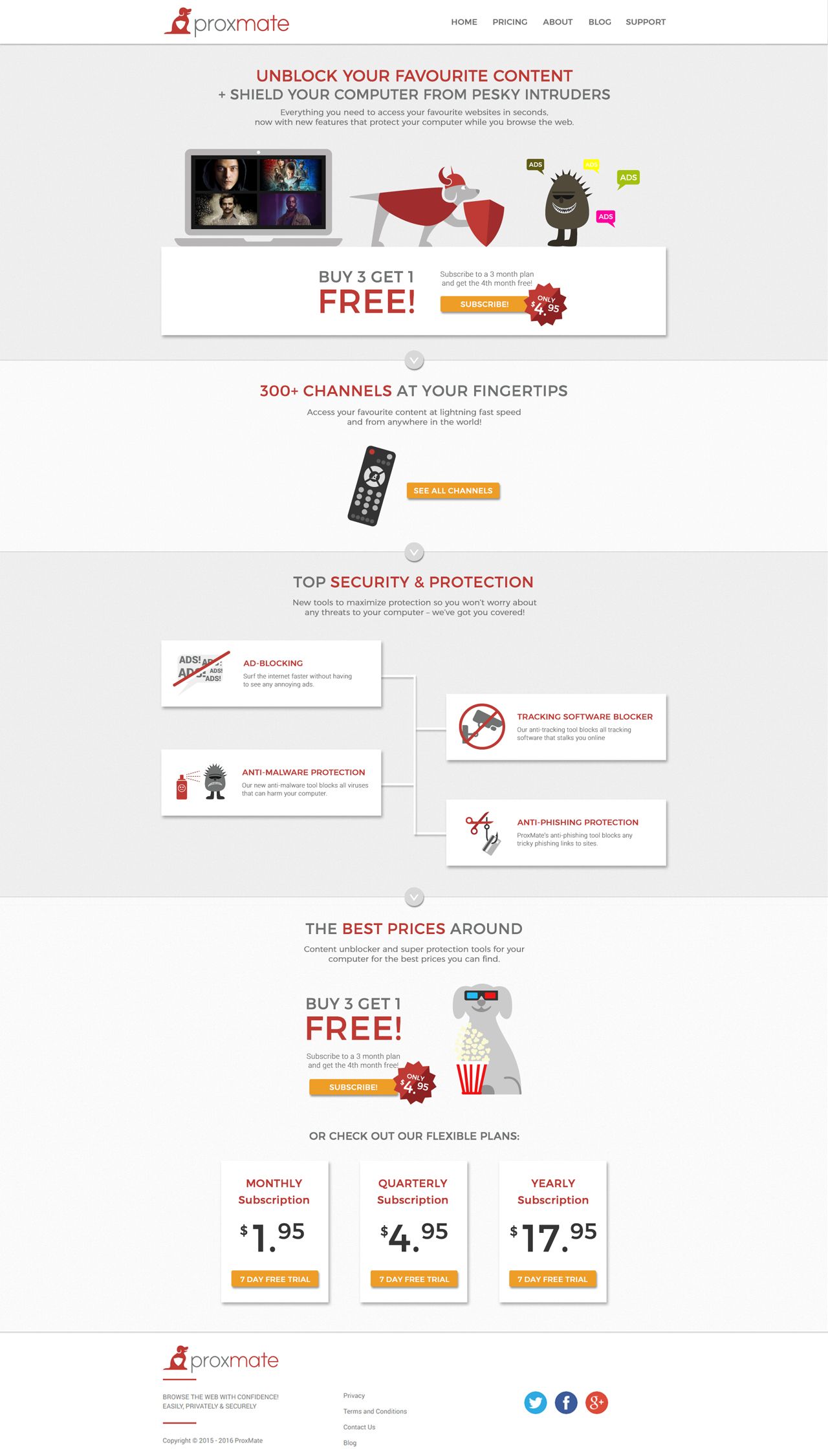
Proxmate went through a management change that set into motion a rebranding which included a website redesign to, of course, be in line with the new branding and to better reflect the product, its features and what it brings to the users.
Steps
1 - Gathered business requirements
Proxmate stakeholders requested a website that would persuade users to try the trial and eventually buy a subscription. The company had done the user research themselves and we saw that our focus would be men, 18-40 years-old and tech savvy. The design had to be straightforward and frills-free and it should focus on the features since this group had a clear problem (blocked content) and was looking for a clear-cut solution. Less “you’ll feel like a million bucks when using this” and more “this will definitely do the job - and more”.
2 - Ideation, created versions of the extension
In collaboration with the marketing manager, I worked on the customer journey map, the user flow and the sitemap. I built wireframes and then worked on various design iterations of the website until we had our final design.
3 - Tested the design with first time users
I gathered users from the target group to test out the interactive InVision prototype and see if there was anything unclear or if the journey had any issues. They had to complete specific tasks and walk me through their thought process while doing so. I also asked them to browse the website as if they just landed from google after searching “how to access YouTube when it’s blocked in my country?”. Most people scanned the first page where they made comments like “wow, they do this too?”, then clicked on the Pricing page and quietly went for the Channels. There they became enthusiastic and wanted to try Netflix. I fixed a few issues with the journey and some illustrations that seemed unclear and we had our design ready to go.

4 - Prepared the design for development
With everything tested, set and approved, I prepared all the assets for development. The Front End Dev and I worked closely throughout the development to make sure everything was implemented perfectly.

//Rebranding for a browser extension
Role: Visual Designer. Collaborated with the Product Owner.
Proxmate is a browser extension that enables users to bypass regional restrictions and browse previously restricted websites at high speed and completely privately. It started as a developer’s hobby project and evolved into a business that served over 300K users.
Proxmate went through a management change that set into motion a rebranding - they wished for the brand to be perceived as friendly and trustworthy, to imply protection and security and to subtly hint at one of the main channels users could unblock using their service.
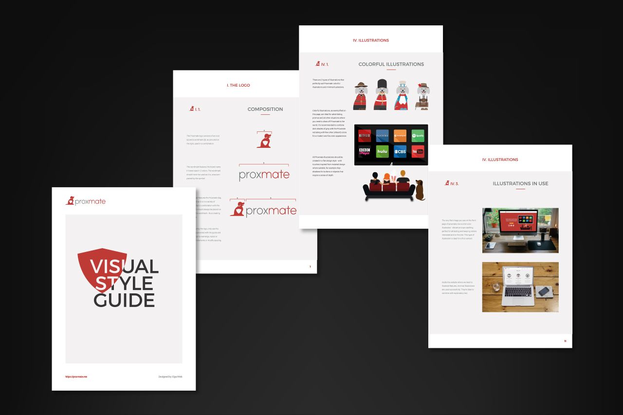
For the wordmark I used and modified the font Print Clearly, a light font with rounded letters and no frills, giving off trustworthiness and a straightforward attitude. The icon represents a dog with a shield in the center - quite obviously implying protection, safety and friendliness. The red and gray colors signify determination, action, energy and illustrate the playful personality of Proxmate while underlining its reliable and dependable characteristics.
I tested the design remotely with a panel of 12 of the target users (who had never used Proxmate) and it received positive feedback; they did indeed perceive the brand as friendly and they were more than interested in using the extension.
Along with the logo, I created icons, illustration, a style guide and a Design Pack that I uploaded to the company’s Drive account for future use.

