Role: UX/UI Designer. Collaborated with the Product Owner, the R&D Manager, the Marketing Manager and the Development team. We worked Agile in sprints.
Main challenges: Simplifying the customization process and building a user journey that spreads across multiple platforms.
Insignety offers jewellery retailers a software, a design studio, that helps their clients personalize their rings with graphic elements, diamonds and even add their own biometric elements: heartbeat, fingerprint or handwritten text. The company wanted to have a version of their design studio available online so users can personalize their rings at home and go to an Insignety store only for size fitting and adding of biometric elements. We called it the “online designer”.
The Insignety design studio is only available in store and management requested that the studio be available online as well so users can customize their rings from home.
Steps
1 - Gathered business requirements
The company wanted to have a version of their design studio available online so users could personalize their rings at home and go to an Insignety partner store (all over Europe and had plans to spread to the US) only for size fitting and adding of biometric elements. We called it the “online designer” for simplicity.
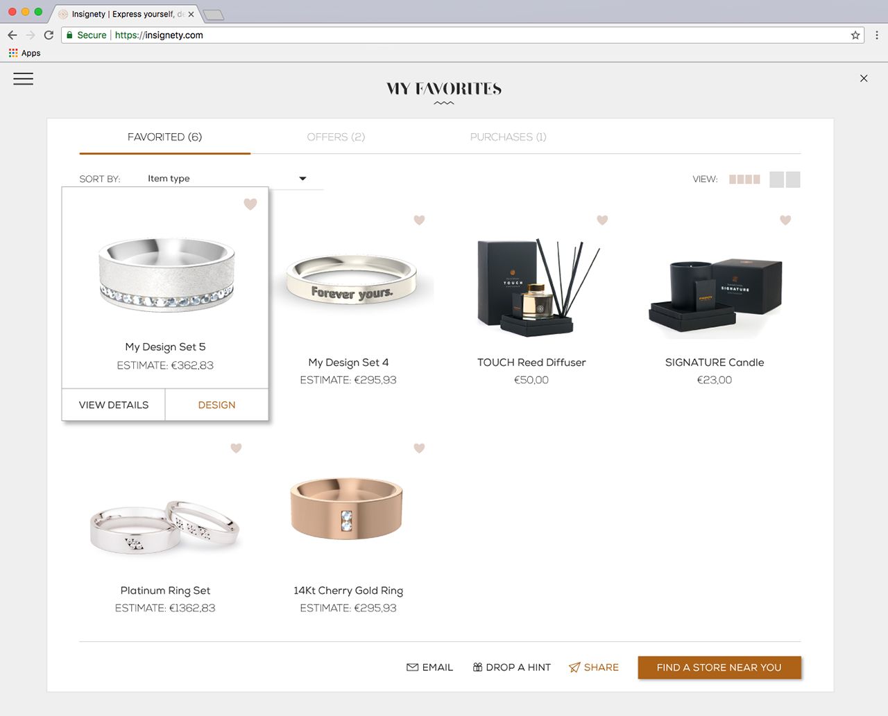
In addition to redesigning for scalability and ease of use, due to upper management requests we needed to add a Favorites section that synchronised products added from the Wordpress website (branded perfumes, candles and luxury handbags) with jewellery pieces added in the online designer. This created a number of complications, especially with the user journey.
2 - Researched the clients and potential users
Insignety clients were typically couples between 25-40 years old who design their own wedding rings in jewellery stores - I researched the current clients and the target group, their needs, problems and desires, and we had our persona. Our Sophie was 29, middle class, college educated, working as a Marketing Specialist and engaged. She was looking for unique wedding bands for her future husband and herself, rings that would wear their personal marks, and didn't want to spend too much of her limited free time searching. The ring also had to match her engagement ring, so it needed to be custom made and still affordable.
3 - Tested the current software - in store and with first time users
Since we already had the software, I conducted usability testing to see what issues came up that we would have to avoid/solve in the online designer version. Current clients didn’t use the software directly - jewellery store employees were trained by Insignety on how to use the software and they were the ones to gather the exact wishes of the clients and manipulate the software with the client seated next to them.
I assisted on a number of design sessions to see exactly how clients interact with the software and confirmed that the design of the software itself mattered little to none to the clients - since they were not the ones using it. The beautiful final 3D rendered images of their rings, assuming they were exactly as they wanted them, were the most important aspect of the software. Store employees, when interviewed, mentioned other issues pertaining to the sales process (before and after the actual design session) than the software, and the need for additional features that clients were asking for.
I conducted usability testing sessions with 8 people within the target group (women, 25-35yo, middle class, in a relationship/engaged), live and remotely on TeamViewer + Skype, to see how users who see the software for the first time actually use the software. I asked them to design a ring for themselves and later give them specific tasks to accomplish.
Some issues they ran into:
- People either didn’t see the Library button or didn’t know what it was and ignored it - but were excited when they saw all the design possibilities it offered. Solution: change the name/icon and place it somewhere more visible.
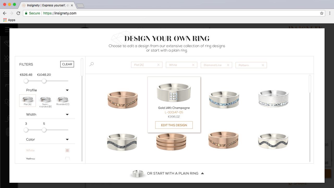
- Most users were not particularly creative and only wanted to do something “cooler” after they saw the possibilities in the Library. Solution: before entering online designer, they will first choose to edit a library ring OR a plain ring. This would be different from the competition as they typically provided the user with a plain ring or very few (and simple) design options to choose from.
- While the menu on the left and the right of the canvas was very attractive, the users were confused by choosing a feature on the left and editing it on the right. They couldn’t find the Delete button with ease either.
- They had difficulty in understanding the “outside” and “inside” of the ring.
- When they understood that they could place features inside and outside of the ring, they had trouble finding the buttons to switch sides - as you would “be” on a side and what features you chose were placed on the side you were on. It wasn't obvious enough which side you were editing.
I also wanted to test a few assumptions for business purposes, including a rather important one: customers would prefer to have their ring size taken in store, as opposed to using a sizing sheet and measuring their fingers or using free plastic sizing rings sent in by mail, all with their own advantages and disadvantages. I created a survey and asked people from our target group (429 responded) a variety of questions - some of the results were:
- People definitely preferred to have their ring size taken live, in a store, more than any other option;
- They were not willing to purchase something very expensive online (the average ring order was around €1000) and preferred to pay in store;
- They were very interested in creating something entirely unique to them and their relationship;
- They absolutely embraced the idea of having an “expert designer” assist them in store for free and perfect their rings, after designing their rings as home. People even left comments that they were especially interested in this service because it was free.
Our model was validated. Previous clients also mentioned that they enjoyed the experience of having someone assist them in designing their rings, so it was great to see it validated by people who had no knowledge of the existing service. So there we had it - users would design their rings online, they’d get invested in a design, they could come back to it again and again - and then find an Insignety partner, get their sizes taken and online rings adjusted and make a purchase, perfectly confident in their choice.
Now we had our problem statement: “Engaged couples would like to have wedding rings that are unique, personalized to their bond, high quality, sized perfectly - and ready in a short time”. The long process of finding the perfect rings was the most common issue with the married people I interviewed in a different session about how they decided upon their rings - the online designer would make it much faster since people could design their rings at home and then perfect them in just one hour in store. So let’s get to work!
4 - Ideation - created versions of the Online Designer
I developed flow charts and journey maps, not only of the new online design studio (its own platform), but also the website (WordPress based) and how it all lead to the brick and mortar jewellery store visit where they went through another flow. The development team also confirmed it was completely doable to implement a favorites section in the online designer where people could have items from the website along with new design sessions/rings generated by the online designer.
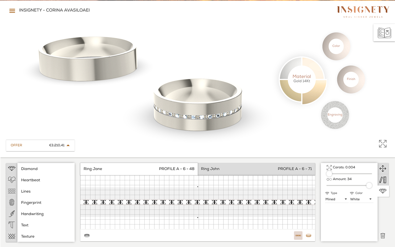
Once I had the journey map, I planned the user flow and set out to build a layout, starting with the menu behavior - I made a few versions and the team and I poked holes in them to see which would behave better when scaling up and adding features and possibilities. It should also not bother the user with constant sliding in and out when editing. Winner: sticky menu on the left since it proved to be a very intuitive (and easy to scale) setup that most users are familiar with and a fixed editing panel.
The interface should be intuitive and quick to navigate, so in order to achieve this:
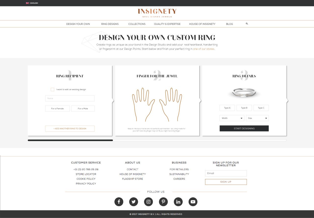
- Designed an entry screen where users will choose to design a plain ring or edit a design - encouraging them to edit a design since in testing, users seemed a little overwhelmed by a blank canvas;
- Some guidance is helpful when you use a new software, but tooltips are annoying - even most people who suggest them, when asked if they read them, say they always close them. So I designed Suggestions and disappearing Quick Tips. When starting a design, a focus is placed on the editing panel by placing a black overlay over the rest of the software and the user can read short suggestions without being overwhelmed from the very beginning by a totally new environment. Quick tips are tied to features, they slide into view over the editing panel and then slide back away from view.
- I adjusted the placing by removing the need of “being on the inside or the outside of the ring” and simply having buttons for “place inside” and/or “place outside”.
- Designed a fixed section for the “placed” features so the user can always double click and edit them at will.
- Designed new clearer icons for some of the features so the user knows what to expect.
- Designed a Favorites section with a quick view and easy adding of new design sets (sets of two rings, typically engaged couples like to design both their rings at once so they are somewhat similar).
- Added a few simple designs to the Line feature. More premade options = happier users.
- The Heartbeat, Fingerprint and Handwriting features require the use of special tools in actual jewellery stores, so to encourage people to try them out regardless, we had samples available that they could place on the rings. If they saved the design and went to an Insignety partner, the sample would be replaced with their actual biometric elements.
5 - Test, adjust, repeat
As soon as I had a set of features completed, I recruited 5 people from our target market and tested the features with them either in person or remotely through TeamViewer while in a call. Some features were not clear enough and required tweaking of the UI and interactions and some flows were still too complex, so I took into account all the findings, made the changes and organized another session with new users to test again. After this final session, we had our fully polished prototype.
Meanwhile I also designed a version to use in stores that included login and sizing screens and wizards for the heartbeat, fingerprint and handwriting features.
I prepared a pattern library with the intention of growing it into a proper design system.
6 - Documented the design on Confluence
We first planned how the design and development would work in parallel in sprints in stages, so the developers would work on something while I prepared the design for the next sprint's features - then we worked in 2 week sprints.
I used Confluence to document the design - I developed a style guide, wrote user stories, uploaded animated interactions and all assets for development. We worked with an external development agency and we collaborated successfully throughout development.
7 - Results
The new webtool was well received by the jewelry stores staff who took to using it successfully with little training, and we had a good number of users creating custom rings from the comfort of their homes. I am not at liberty to disclose numbers, but we were happy with the amount of customers. Monitoring the app and the user behavior on the website revealed some usability issues, some odd behaviors and it was interesting to see how many users would create an account and come back to design their rings (up to 87! times) before abandoning or placing an order. We kept iterating and making improvements over time.
Unfortunately, the company had to cease activity after 5 years of business.

