Role: UX/UI Designer, UX Researcher, also dabbling in front-end coding. Was mentored by the Full Stack Developer with whom I worked closely in order to learn more coding, and collaborated with the Head of Growth and the Marketing Manager.
- Improved the user journey, information architecture, UX, adjusted the UI. Designed and developed new pages under the direction of the Full Stack developer using HTML, CSS and a touch of JS. Collaborated with the Head of Growth, the Communications Manager and the Full Stack Developer.
- Worked on growth experiments as part of a framework that enabled our team to test assumptions and potential new features to ensure they are successful before introducing them to all of our users. I conducted user research and used the resulting insights to start experiments that would increase conversion rate.
I'm writing about these 2 topics together as they have gone hand in hand.
About
Everyone.org (previously TheSocialMedwork) is an international pharmacy that specializes in providing medicine to patients living in countries where the medicine is not yet approved. For example, a medicine is approved in the USA, but it takes months or even years until it's approved in another country, let's take for example Japan. Everyone.org uses a little known legal pathway to provide that medicine to patients in Japan even if it's not yet approved there - but it has to be approved somewhere in the world.
On the website, users (I'll call them "patients" from now on since they're typically patients searching for medicines) place requests for information on a medicine's page and the Patient Support team contacts them directly to support them to access medicine. It's a high touch process once the request is with Patient Support due to a few factors:
- different countries have different regulations and paperwork requirements;
- shipping varies depending not only on the country, but also on where the medicine comes from and if the medicine requires a cold box (a very expensive box that's used to transport medicine that must be kept cold);
- we require prescriptions, we don't send any medicine out without a prescription;
- patients often aren't sure what quantities and dosages they were prescribed and how much they are allowed to purchase.
Basically, it's not a typical pharmacy where one can order on the website, introduce their address and receive it home in a few days. The medicines sold on the website are unapproved or unavailable in many countries, they are for difficult conditions and they are very recently out of clinical trials so they are quite pricey. Automatic processes are then difficult to implement (but we have implemented one, check the project "Patient Portal").
As part of the Growth team, my main goal was to increase page view > request conversion and overall just get as many requests for medicine as possible (ideally from patients with prescriptions) that the Patient Support team could then convert into sales.
Main challenges:
- Showing the utmost care and empathy when interviewing users. Our users and customers are patients or family/friends of a patient with a difficult condition, typically forms of cancer or neurological conditions like ALS or Multiple Sclerosis. It's a very difficult situation to be in, they are usually stressed or anxious when speaking about the condition or their treatment, so they require a different style of conversation than say, interviewing a user of an electronics store website. I'm an empathetic person, but still had to put a lot of effort into making sure they are at ease with me and comfortable speaking.
- Redesigning the website in stages (as opposed to redesigning the website all at once, which must be every designer's dream) and doing it seamlessly while keeping the same style at every stage.
- Conducting growth experiments in ways that are statistically sound, considering we don't have the high volumes of traffic that other websites have.
Steps
1 - Gathered business requirements
The CEO's goal was to present the company as trailblazers, going where few have gone in providing medicines where it seems impossible to do so legally. They wanted a focus on the mission, the vision, on the people that we are helping. The website design had to reflect our values and mission.
The Head of Growth wanted an improved user journey that would help users reach their goals and in the process would bring us more requests and in the end more sales.
2 - Researched the users
When I started working in the company, one of the first things I initiated was conducting research on first-time users. 9 were recruited as they were visiting the website to learn their motivations, goals, how they perceive the website, what they thought at every step of the way.
As always with this type of ride-along interviews where the researcher observes the user as they browse and do tasks, many interesting insights come out. A selection:
- patients looking specifically for medicines not approved in their country didn't understand that they are able to get the medicines from us even if they are not approved: "NHS have said that only children can have it and so I don't know what they could do really... Could this be shipped anywhere? I don't know how that would work.";
- the CTA was confusing, it was "Make an enquiry" - they didn't know what to expect and "enquiry" was particularly confusing to people whose first language wasn't English. I checked with Google Translate and it turns out that the CTA doesn't get translated correctly into other languages, more like "Conduct an investigation" or nonsense;
- delivery information was very standard (5-10 working days) and didn't really spark trust with the users since it was so boilerplate. Some users wanted to know what shipping companies we work with and especially if we work with local companies because they had bad experiences with local companies and only trusted foreign ones;
- patients didn't realize they need a prescription before they placed a request;
- patients had issues trusting a website that sells high priced medicines and kept searching for information about the company, especially licenses and they were not very easy to find.
I conducted interviews with patients who have ordered medicine from the company to assess their experience on the website and with our service overall. The insights showed that patients had taken their time researching the company before they placed a request, they asked about us on other websites, asked their friends in the Netherlands whether they have heard of us and inspected every page of the website and every word in the licenses. They then complained about the complexity of importing medicine and the fact that they didn't understand what they were signing up for when they placed a request.
I also implemented surveys on the website in strategic places to gather insights regarding specific user segments. One such important segment consists of blog visitors - a high number of visitors who read our blog pages, sometimes browsing more pages on the website including product pages and then promptly leave. These users are at the very bottom of the funnel, they are only researching medicine options, they don't have prescriptions and are nowhere near ready to buy.
3 - Redesigned web pages, designed and built new ones
The user research showed that we had a lot of work to do.
I initiated the below:
- redesigned the "About us", "Transparency", "Contact us" and "Healthcare professionals" pages. They received many visit prior to placing a request and they had to show legitimacy, a clear mission and build trust. The "Healthcare professionals" page is dedicated to doctors, but I redesigned it and moved it in a more visible section of the website as it helps patients trust us if they see that we work with physicians. I redesigned the homepage to focus on the search bar, on our team and the patients we've helped, but the CEO had more of a hand in the design than I did.
- brought improvements to the blog pages design as they account for a good chunk of our traffic, after product pages.
- designed and developed a "How it works" page that we linked to from the product pages so that users understand our atypical way of working.
- wrote, designed and developed under the supervision of the Full-Stack Developer a number of legal pages and created a new section called "Is this legal?" - the question most frequently asked by first time users, as well as pretty much everyone speaking with an employee from the company who mentions what we do. The pages are "Legal framework" (explains how we can ship unapproved medicines), "The prescription" (explains why a prescription is required) and "Country regulations" (explains why regulations are different per country, offers solutions for some common barriers and shows a number of countries' government websites regulations).
- designed and placed on the product page a number of downloadable guides to importing medicine into [country] to offer to our visitors for free.
- included sections on the blog posts that lead people to the legal pages so that they are aware that they can in fact order medicines from us even if they are not approved in their country.
I worked with Figma to create wireframes, detailed designs and interactions, I used Adobe Photoshop for any image editing and Adobe Illustrator to create icons and illustrations.
I was mentored by the Full Stack Developer, Jules Boven, so I could develop some of the pages I designed, navigate the complex Magento back-end and use Github for version tracking. I used plain HTML, Flexbox for CSS and started learning Javascript so I could understand and adapt easy scripts for the pages. My career goal is to learn as much front-end development as I can so I will be able to code my own designs. I can currently code static pages and introduce simple interactions.
I wrote some of these web pages before designing them because I have some qualifications such as having a Bachelor's degree in Journalism and some copywriting experience - the "wanderer" past before deciding I'm more interested in UX, getting a Master's degree in Multimedia production and specializing in UX. This minor experience has proved to be an asset even as a UX designer.
4 - Started or contributed to growth experiments
The research I conducted informed growth experiments so my team conducted many experiments based on the insights collected. We used Trello to propose experiments, labeled by AARRR funnel, giving them an ICEE score, detailing our assumptions, how we will prove whether they are correct or not, our metrics and more. I learned a lot about how to conduct experiments and analyze data from the Head of Growth.
We relied mostly on Google Optimize to conduct and track experiments and tools like Hotjar (CrazyEgg and most recently Microsoft Clarity) to see our users in action. We analyzed the data using Google Analytics and Amplitude, I'm quite a big fan of Amplitude and how they create charts and funnels based on events.
Some experiments of course failed despite me and my team having a lot of trust in them, some were successful and were implemented on the website.
Some successful experiments I initiated (successful meaning = they either improved the conversion rate, they increased the overall number of requests or the tickets showed fewer questions about legality, processes, delivery):
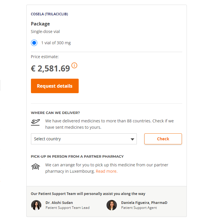
- "Where can we deliver" section on the product page where users can check whether we have delivered to their country before and if we can deliver to them (a very common question included in requests), along with a small "Read about pick-up options" section right underneath with the sole purpose of encouraging pick-ups;
- A mini FAQ close to the CTA to answer the most important questions users have;
- Under the medicine name on each product page: a small section that writes 1. that a prescription is needed and 2. that we can deliver even if the medicine is not approved;
- Showing the faces of some of the Patient Support team members under the CTA to build trust;
- Change the CTA text to something easily translated into other languages (from "Make an enquiry" to "Request details");
- pop-up the enquiry modal (the form that users see when they click on the CTA to request more details) after a certain amount of time on the page or when the user reached the bottom. This was not insight based, but my idea of "let's try something everybody else does and see if it sticks" type of experiment despite me and everybody else on the planet disliking pop-ups. Can't hurt to try, right? This is how I learned that that's why there are pop-ups everywhere: because they work, and quite well... I observed a 24% increase in the number of requests due to the pop-up and 31% increase if I repeated the pop-up a certain amount of time after it was closed by the user (we didn't implement the latter because I'm not a monster).
5 - Results
Redesigned pages and new pages
Bounce rate dropped sensibly for all the redesigned pages and we noticed traffic going from product pages to the new legal pages and then back to product pages or Contact us page. The redesigned Contact us page showed an increase in conversion rate of 16% (patients sometimes use the contact form to request medicines).
Subsequent interviews showed that patients visited the legal pages and were much better informed than patients who visited before we implemented these pages.
Experiments:
Of course some experiments I initiated failed, some spectacularly so, dropping the conversion rate. Thankfully that's why we experiment, so we don't implement on the entire website elements or features that can cause damage, so I quickly scrapped them as they were running.
Thankfully, with other experiments the conversion rate increased (a different percentage depending on the experiment), we received fewer questions about processes and deliveries and we managed to increase the number of pick-ups from pharmacies (an alternative to home delivery and a very important service for patients in the only 4 countries of the world where we can't deliver medicines).

