Role: UX/UI and Visual Designer. Collaborated with the Product Owner (Director of Marketing, Ortho Channel), Product Manager, Scrum Master, two Content Managers, three Developers. We worked Agile in 2 week sprints.
Main challenges: Building a user friendly navigation, building scalable design templates, finalizing large amounts of (content and) visual design under a tight deadline.
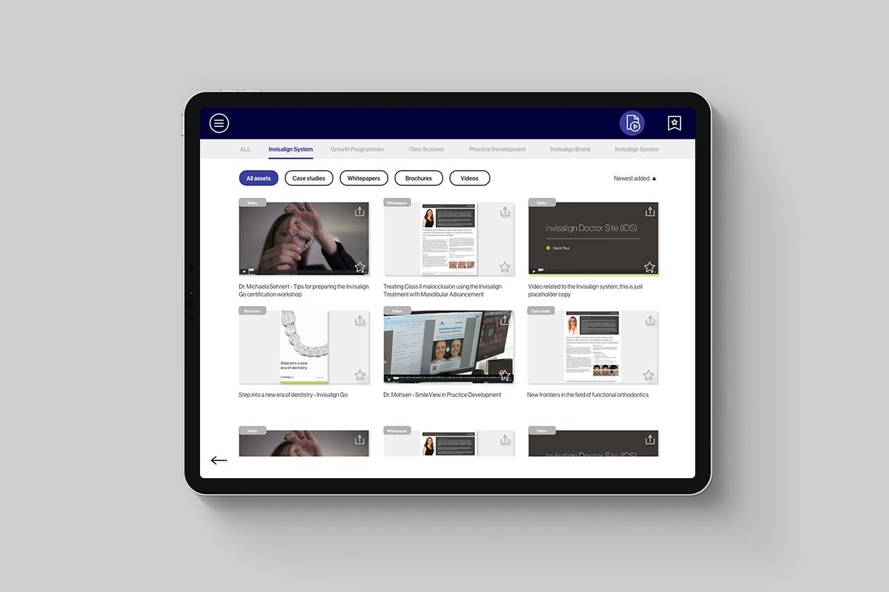
The Focus App is a strictly iPad app, an internal app that is used by Align Technology's Territory Managers in EMEA in their sales process with Orthodontists or General Practitioners. The app is a visual aid in the selling process that helps explain and visualize all the products and features of Invisalign and iTero, as well as any commercial, educational, promotional extras.
Steps
1 - Gathered business requirements
The original app has been designed and built by an external agency and despite having this visual aid at hand, the Territory Managers did not use it. The issue was expressed by all the users: the navigation was too difficult to use, especially in the middle of a meeting/sales call with a doctor because finding a specific piece of information took dexterity, memory and some time. The UX was not fast and intuitive and the Territory Managers stopped using the app - despite it being, in perfect conditions, an extremely useful sales aid.
In short, all the content was presented in a slideshow format - ~over 100 slides with information + some tabs and if you wanted to reach slide 57, you would either swipe until you reached there or kept pressing on a thumbnail and trying to slide until you saw the thumbnail of slide 57 (if you knew/remembered how it looked like or could read the title in the thumbnail, there was no title text anywhere).
The second reason the business wanted to redesign the app was because they wanted to bring it in-house into a CMS system so it would be easy to update and add to the content - as opposed to the current costly and time intensive updates. Adding new useful features was a very welcome bonus.
2 - Researched the users
Our users were Align Technology Territory Managers who used the app in their sales process with doctors (Orthodontists and GPs). In a meeting with a doctor, they would talk about specific Invisalign features or iTero products that the doctor might be interested in and bring up the complete information on their iPads to show to the doctor (or talk about it in depth, if on a call).
I conducted live usability testing sessions and interviews with TMs to see exactly how the original app fared, what the pain points were, what worked well and what the users wanted out of the (new) app. The navigation was the most crucial problem to solve, as the app was practically a carousel with 60 individual screens that you would have to slide through in order to reach a specific section.
The users however reacted great to the UI - it was less than subtle (had large round or rounded buttons), but perfect when Territory Managers were face to face with doctors and needed to find information at the speed of light. Goodbye minimal sleek UI, it was nice considering you, welcome super clickable big buttons.
3 - Ideation - created UX and UI mockups
I started by mapping out the user journey and user flow - we could achieve the perfect user flow through multiple types of navigation, so I created multiple options as rough wireframes but animated them and made them clickable in order to test them without the influence of UI and personal taste. I tested them with our users and refined them until we had our final most intuitive navigation, which included a classic hamburger menu for the main menu and a navigation bar at the top of the screen. Our users required a navigation that was not only simple, but felt familiar and allowed our Territory Managers to find information fast while face-to-face with a doctor. Fast, easy and intuitive was what we needed and the final iteration had it all. I also built the UX for other features that were requested by the business, such as a "toolbox" with videos and PDFs with filtering and a favorites system for easily accessing information even faster.
The UI and visual design went through approval processes with the Product Owner and VP.
I also created the content template designs that our developers then built into the CMS for easy content creation in the future. They had to be flexible, reusable, scalable and, of course, allow for creativity.
After the entire content was prepared by our content creators from different departments (Orthodontics, GP, Education), I was responsible to design it keeping within the constraints of our design templates but also making them as visually attractive as possible and prepare the assets for development/CMS. A design prototype was our content source of truth since it contained final designs and content (a giant XD file, RIP my processor, but the clickable prototype was easily accessible in the browser for everybody else).
4 - Prepared the design for development
We planned the process on how the design and development would work in parallel and we set milestones, then worked in 2 week sprints. I prepared the wireframes, user flows, pattern library, interaction guides and all assets for the visual content and documented the features in Confluence. The developers and I collaborated effectively throughout the process.
5 - Tested the mockups and developed app with the Territory Managers
I tested prototypes of the UX with individual Territory Managers as I was building them. After the developers built a working prototype, we had a full day User Acceptance Testing meeting with 15 Territory Managers who tested the actual app following a script, as well as live usability testing 1-on-1 sessions with me. We found a few bugs and some content and usability issues - overall it was a (surprising) success. Testing sessions don't usually go this well. After tweaking the content and fixing the usability issues, we had our app good to go.
6 - Managed design assets in the CMS
We used Contentful as our CMS and I helped prepare and add content and visuals, making also minor code changes (only HTML and CSS) so the content fits well in our templates and the final result is perfectly polished.
6 - Results
The app was launched at the Align EMEA Sales Conference 2020 in Barcelona in January where almost 600 people attended - it was a complete success and the Territory Managers have been using it in their work ever since. While at the conference I was happy to see the TMs use it successfully and sat though sessions of them swiping through it trying to find specific information and they gave me extremely valuable information that I haven't received in testing, so back to our office in Amsterdam I was able to put together the feedback and make adjustments. The app is since being used throughout EMEA in local languages and is being updated regularly.

